


COLOR CONTRAST ANALYZER by flicktool.com
Ensure your designs meet accessibility standards with precision
Text Preview
The quick brown fox jumps over the lazy dog
Normal Text (16px)The quick brown fox jumps over the lazy dog
Large Text (18px bold)Suggested Color Variations
About Color Contrast Accessibility
The Web Content Accessibility Guidelines (WCAG) require:
- AA compliance: At least 4.5:1 for normal text and 3:1 for large text
- AAA compliance: At least 7:1 for normal text and 4.5:1 for large text
Large text is defined as 18pt (24px) or larger, or 14pt (18.66px) or larger if bold.
Color Contrast Checker – Test WCAG Accessibility Online
Check color contrast ratios instantly and ensure your designs meet WCAG accessibility standards. FlickTool’s Color Contrast Checker calculates the contrast ratio between any foreground and background color combination, tests AA and AAA compliance levels, previews real text readability, and suggests accessible color variations—all in real time with no design software needed.
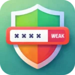
What is Color Contrast and Why Does It Matter?
Color contrast measures how visually distinct two colors appear against each other, expressed as a ratio (e.g., 4.5:1). Low contrast between text and background makes content difficult to read—especially for users with visual impairments, color blindness, or aging eyes.
The Web Content Accessibility Guidelines (WCAG) set minimum contrast standards that websites must meet for legal accessibility compliance. Failing these standards excludes millions of users and can expose websites to accessibility lawsuits. FlickTool’s Color Contrast Checker makes it effortless to verify compliance before publishing any design.
How to Use the Color Contrast Checker
Testing a color combination takes seconds:
- Pick a Foreground Color using the color picker or enter a HEX code directly
- Pick a Background Color using the second color picker
- Adjust Saturation using the sliders to fine-tune each color if needed
- Read the Contrast Ratio displayed instantly in the center panel
- Check WCAG ratings showing AA and AAA pass/fail status
- Preview real text in both normal (16px) and large (18px bold) sizes
- Explore suggested variations from the color palette grid for accessible alternatives
- Use Swap Colors to instantly reverse foreground and background
- Use Randomize to generate new color combinations for inspiration
Copy any HEX code with one click using the copy button next to each color value.
Understanding WCAG Contrast Standards
WCAG defines compliance levels based on contrast ratios:
| Level | Normal Text | Large Text | Use Case |
|---|---|---|---|
| AA | 4.5:1 minimum | 3:1 minimum | Standard legal requirement |
| AAA | 7:1 minimum | 4.5:1 minimum | Enhanced accessibility |
Large text is defined as 18pt (24px) or larger, or 14pt (18.66px) or larger when bold. Larger text is easier to read at lower contrast, which is why WCAG allows a lower threshold for it.
AA compliance is required by most accessibility laws including the ADA (USA) and EN 301 549 (Europe). AAA compliance is recommended for critical content like medical or government websites.
Key Features of This Color Contrast Checker
Real-Time Contrast Ratio
The contrast ratio updates instantly as you adjust colors. It uses the WCAG relative luminance formula, comparing brightness on a scale from 1:1 (no contrast) to 21:1 (black on white, maximum contrast).
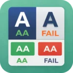
Three WCAG Rating Cards
Three compliance cards show pass or fail status simultaneously for AA, AAA, and AAA Large Text—so you can see all compliance levels at one glance without switching views.
Live Text Preview
See exactly how your color combination looks on real text before committing. Two preview blocks display normal text (16px) and large bold text (18px) using your selected colors, eliminating guesswork about real-world readability.
Suggested Color Variations
The palette grid generates accessible alternative color combinations based on your input. This helps designers find compliant variations without manually testing dozens of HEX codes.
Saturation Control
Fine-tune color saturation independently for foreground and background. Particularly useful for finding the minimum saturation that still passes WCAG standards while maintaining brand color identity.
If you work with color regularly, also check out FlickTool’s Color Palette Generator for building complete accessible color schemes from scratch.
Who Should Use This Tool
- Web designers: Verify text legibility before delivering mockups or final designs
- Frontend developers: Test color combinations during component development
- UX/UI professionals: Ensure interfaces meet accessibility requirements in design reviews
- Content creators: Check blog or social media graphic readability
- Accessibility auditors: Quickly validate color pairs during WCAG compliance audits
- Brand managers: Confirm brand color usage meets accessibility standards across digital touchpoints
Frequently Asked Questions
1. What contrast ratio do I need to pass WCAG AA?
Ans. Normal text needs a minimum ratio of 4.5:1 and large text (18px+ or 14px+ bold) needs 3:1 to pass WCAG AA compliance, the standard required by most accessibility regulations.
2. What is the difference between AA and AAA compliance?
Ans. AA is the standard legal requirement with a 4.5:1 minimum for normal text. AAA is the enhanced level requiring 7:1, recommended for critical content but not legally mandatory in most jurisdictions.
3. Does the color contrast checker work with RGB or HSL values?
Ans. The tool uses HEX color codes as the primary input format. Use the native color picker to select any color visually, or enter a HEX value directly for precise control.
4. Why does my brand color fail the color contrast checker?
Ans. Many brand colors are designed for visual identity rather than accessibility. Try darkening the foreground color, lightening the background, or using the suggested variations panel to find a compliant alternative close to your brand palette.
5. Is color contrast the only factor in web accessibility?
Ans. No. Color contrast is one component of WCAG compliance. Full accessibility also requires proper font sizes, keyboard navigation, alt text for images, semantic HTML, and screen reader compatibility.ce. Full accessibility also requires proper font sizes, keyboard navigation, alt text for images, semantic HTML, and screen reader compatibility.